
The key to producing captivating visual images and communicating non-verbal signals on your website is to pick the right colors.
You are already aware of the most effective colors for websites and their functional reasons (Top 10 colors for websites). You’re aware that particular hues have a distinct effect on how you feel or what you think of.
To get the most out of your website, however, there are some dos and don’ts while selecting color schemes.
What are Website Color Schemes
Simply knowing the best colors to use when designing a website isn’t enough. You need to understand how to combine several colors to come up with a beautiful, engaging, and informative design.
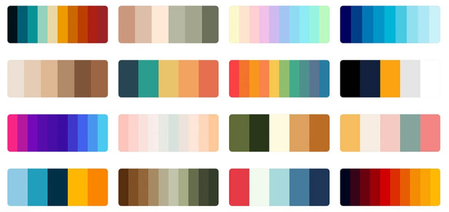
Website color scheme is the assortment of colors a designer selects for their website design. Color schemes, also referred to as color palettes can have whatever number of colors the designer deems appropriate. Each color can be applied to a range of items on the website, therefore the same color may be applied to many sorts of elements.
Color palettes are generally divided into two categories of colors: primary and secondary. The primary colors make up the majority of the site’s color scheme, including the backdrop, logo, menu, etc. Secondary colors are frequently used as accent colors, among other uses.
A color palette will frequently have many tones of the same color, giving the website a unique yet unified sense across its design.
One of the key principles when developing a color scheme for your website is consistency. This is because having a strong brand personality is essential to running a successful website and business. Sticking to a consistent color scheme helps to establish your brand identity. Your audience will start to associate your brand with the colors and styling you employ frequently.
Dos
#1. Do your research
If you are reading this part, then you are on the right track because it shows that you are doing your due diligence to make an informed decision. You are doing research! Coming up with the most suitable color schemes for your website is a huge decision that is going to determine a huge part of your website and business success. That calls for an informed decision, which is only possible through thorough research before you begin the website design.
It’s of great essence to understand your target audience, including their age group and gender. Understand your brand personality and your industry in general which should guide you through the choice of colors.
Study the color psychology basics to clearly understand its role in marketing. Get acquainted with color theory as well and seek to know how to mix different color combinations effectively.
Target audience
Your website should always be customized for your intended audience. Who are you trying to reach out to and market to? What feelings are you attempting to evoke?
Age and stage of life should be taken into consideration. If you’re an insurance firm, you generally want to use a more respectable color palette than if you’re the neighborhood burger joint serving college students.
Use colors that women prefer, like blue, purple, and green, if they are your target market. For men, you should use more neutral color palettes because they don’t like the color as much as women do.
You can tell that this website is geared toward guys by the use of colors like black and green, which are supposed to convey an air of an adventurous, outdoorsy vibe.
Brand personality
Your brands should be your guide when choosing color schemes for your website. For instance, you can use many various shades of blue, yellow, and red for a children’s website. The doctor should come across as trustworthy, fun, and kid-friendly.
You can get away with more color on websites for children. On a website like those that focuses on the transportation of fine art, those hues would not have been effective. On a website like that, you want to project class. Cream, dark charcoal, and tan are just the right shades of color to keep you interested, yet it still has a very upscale appearance.
If you want to convey elegance, you minimize the colors, whereas if you want to convey fun, you slightly amp them up.
Your industry
While you want to stand out, you also want your users to recognize right away that they are in the appropriate place. Think about what your audience might anticipate seeing in your sector.
Contrary to popular belief, it can occasionally be a good idea to serve your consumer better by doing so.
For instance, there is no doubt that purple should be used for girls’ apparel. If you don’t use any purple at all, your consumers won’t know they are in the proper area. You can use different shades of purple to stand out or use it as an accent color.
Color psychology
Color associations have a lot of power. They begin to form in us as infants and typically last the rest of our lives. These connections are automatic and frequently unconscious.
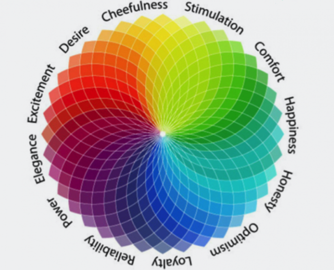
Numerous of these connections are extremely commonplace. For instance, everyone picks up on the associations between yellow and the sun and green and leaves. Some, though, are cultural.
The foundation of color psychology is the belief that distinct hues elicit particular emotions and feelings, which in turn inspire particular actions.
According to color psychology, choosing the color scheme for your website based on the emotional experience you want to provide your visitors will not only have an impact on the personality of your brand but will also cause certain visitor reactions based on the emotional environment you create.
The color theory
Color theory is the science of how colors are created. You must first comprehend the difference between primary, secondary, and tertiary colors.
Primary colors are those that can only be created by combining two different hues. Red, yellow, and blue is the three primary colors.
Two main colors are combined to produce secondary colors. For instance, when you combine the primary colors blue and yellow, you get green (a secondary color).
On the color wheel, adjacent primary and secondary colors can be combined to produce tertiary colors. These result in complex hues; for instance, blue-violet is produced by combining the main colors blue and violet (tertiary).
Next, let’s discuss warm and cold colors. Warm colors include reds, oranges, and yellows, whereas cool colors include blues, greens, and violets.
Third, it’s crucial to comprehend the subtleties of color. You don’t always see pure colors. Numerous colors that you see online have been impacted in some way.
You could be seeing a shade (a color with black added to it), a tone (a color with grey added to it), or a tint (a color with white added to it). Or perhaps the color you’re observing is oversaturated or undersaturated. How brilliant or muted a color is depends on its saturation. Although there is much more, this is the bare minimum to aid in selecting effective color combinations.
The color Wheel
Learning the three categories that the color wheel includes—primary, secondary, and tertiary—is the first step in understanding the basics of color theory.
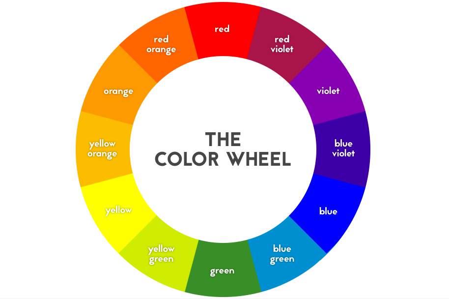
However, given that we are aware of how colors are created, we can describe how they “interact,” or more precisely, how they function together, and we can create our own color combinations.
Despite the fact that the relationships between colors on the color wheel may be classified into certain relationship “categories,” there are a wide variety of ways that these colors can be combined, and this is where color combination types come into play.
Color combinations
Three colors that are next to one other on the color wheel make up analogous color schemes. When attempting to build a modern yet elegant website, web designers frequently choose comparable color palettes.
Among many others, complimentary color combinations include red and green, blue and orange, blue and yellow, and red and blue. These pairs can be distinguished by looking for two hues on the color wheel that are directly opposite one another. They are two opposites of one another, which is what makes them similar. The importance of primary color combinations in web design is that they can make one color, especially accent colors, stand out due to their stark contrast.
Using complementary colors for features like buttons or navigation menus on a website adds a lot of value. Using complementary colors as accents for your text and its background increases user attention because of the strong contrast and separation between the two, which is what you want when you want visitors to notice a button and click it.
A triadic color scheme is any three colors that are 120 degrees apart on the color wheel and is thought to be the simplest kind of color scheme. Triadic schemes can be thought of as having the most flexibility of the three combination types because there are numerous ways to measure 120 degrees.
All these color combinations give a website designer an endless list of potential color palettes hence more room for creativity.
#2. Make plans
Now that you have gained all that knowledge from researching website color schemes and how to apply them, it’s time to start the actual design. Every expert website designer knows that any good project starts with a plan. Use the knowledge you have gathered from your research to plan your website color schemes.
#3. Use tools
Don’t be afraid to make use of online tools. They save you plenty of time while making your work stress free. Below are examples of tools you can use:
Colorspire. It offers you a quick and simple way to test out several color schemes so you can have a better idea of how they will appear on your website. This might help you locate the perfect color combination and save you a ton of time.
Canva. It has already put together color palettes that are excellent. Even if you don’t adopt it exactly, you can use it as inspiration to pick the ideal color scheme for your website.
Coolors.co. You can find complementary schemes by using color generators, such as Coolors.co. You can select up to five colors at once with this specific tool. By pressing the spacebar, you can quickly access a new palette of complementary color schemes after locking a color you like. You can keep locking and switching colors around until you discover a color scheme you like. Then, just paste the hex codes into your design program to see whether your color scheme appears correctly in your graphic.
Others include Paletton, Adobe color, Muzli’s colors, Color designer, Colourcode, and Color inspire.
#4. Keep responsive design in mind
The choice of color schemes has a significant impact on how a website will appear on mobile devices.
In fact, choosing colors with mobile responsiveness in mind will frequently simplify the design process. By doing this, you can ensure that your text elements are equally readable across all screen sizes and that icons and buttons are equally obvious on mobile devices as they are on desktop computers.
#5. Embrace neutral colors
Despite being less exciting, neutral colors are essential for every well-designed color scheme. Every professional color palette needs neutral hues, even if you simply use them for text components. Despite the beauty of non-neutral hues, users of websites will eventually require a break from visual stimulation, especially when reading texts that attempt to convey qualitative information.
#6. Keep it simple
A color scheme can be harmoniously unified by simplicity. Everything will look cohesive if there are only a few colors present.
Additionally, viewers don’t have to exert much effort to understand what is happening. That is one of the characteristics of an excellent website. Your audience will be more perplexed if you use excessive color.
#7. Contrast your colors
The contrast makes an impact. Contrast can specifically direct attention to particular areas of the page.
Use complementary colors to contrast any design components that you really want users to notice from the rest of the page, or at the very least from those that are nearest to them.
#8. Integrate your branding
Think about how the colors in your design will relate to your branding. If your brand already has certain colors associated with it, you can draw inspiration from that palette when developing the color scheme for your website.
You may need to change your brand color if one of the colors you selected has a bad connotation.
#9. Follow the 60-30-10 rule
You could pick at least three colors for your color scheme. Two of the three colors in your design should be cool, and one should be warm.
Use one 60% of the time, and use the other as a compliment 30% of the time. Use a warm CTA (call-to-action). The third color truly grabs your users’ attention because they’ll be used to the first two hues.
#10. Compare different color schemes
You don’t have to stick with the first color scheme you choose. that might be very restricting. Make up three or four alternative color schemes and contrast them side by side.
Then, narrow it down until you find the color scheme that works with your brand.
Don’ts
#1. Don’t allow personal preferences to create bias
Don’t base your color schemes on your personal preferences. Use color psychology instead.
Making blue your dominant color is incredibly alluring if blue is your preferred color.
However, this would be a mistake for a cosmetics company aiming to market to women, and you would often be better off choosing purple or pink.
Have this in mind if you don’t want your personal preferences to end up losing your sales and possibly over time weakening your brand.
#2. Don’t let color get in the way of readability
Opening a beautifully designed brochure or website only to discover that you can’t read the content is one of life’s biggest letdowns. Choosing a text color that stands out is crucial regardless of the background color you select. When making your decision, take into account selecting contrasting typography that highlights your color scheme.
#3. Don’t combine light on light colors
The most typical web design mistake is light text on a light background. Extremely strong colors, and compete with each other. Light text on a background with excessive detail can result in the same problem.
This error is so frequent because the contrast between the text and background may appear fine in print or on some screens. But if you switch to another screen or brighten the current one, you might notice that the readability is reduced.
#4. Avoid overpowering neon colors
While neon might be entertaining, it can be too much on a screen. Remember that screens include backlighting, which makes digital colors appear even more vibrant than they do on paper.
Neons should only be used sparingly or as an accent, if at all.
#5. Don’t overdo bright colors
Warm colors can be overpowering and may distract your audience from your actual content. Keep in mind that you want people to be able to recognize your brand without experiencing headaches or squinting.
Playing with shades is the solution. Warm colors can have their transparency and shades adjusted to prevent eye strain.
Conclusion
You now possess all the resources necessary to design an excellent, captivating color scheme for your website.
Trial and error can be inevitable, but that’s all part of the process. Any effective color scheme will go through a number of revisions.