
Many are times when we overlook the importance of colors when designing our websites. As long as it is trendy, looks good, and feels right then it’s perfect for the website.
That is okay.
However, it’s not enough. It’s very crucial to have in mind a lot more than that when designing your website for it to reach its highest potential of performance.
You might be surprised to learn how much more of effect colors have on website visitors. They arouse particular emotions and might serve as a potent catalyst for your visitors’ decisions.
In fact, studies have found that consumers make snap judgments about things after 90 seconds of exposure, and 90% of those judgments are made solely on the basis of color. How your readers view your website and brand is influenced by the colors you use.
Doing it right can boost learning, understanding, and the readability of your information.
Why Colors for Designing Websites Matter
People react and feel differently to particular colors. The sheer amount of possible website color schemes may leave you feeling daunted and unsure of which to pick. A good place to start is by clearly understanding what each color portrays, which color best fits a particular niche, and what is trending for every industry.
Instead of merely “decorating” websites, web designers make wise design choices based on the psychology of color. Therefore, it’s critical for stakeholders to ignore their irrational feelings or personal color preferences. A talented designer is aware of how crucial it is to assess a color scheme in light of the brand, the meanings of the colors, and the goods or services being advertised. The selection of color affects the entire brand message and has the power to persuade a web visitor to spend more time on a website.
Depending on the color palette you choose, colors can elicit emotional reactions. You might believe that the most important factor is the content. And while it is true, it is not all.
Your audience enjoys content. They are drawn to new voices and alluring content, but you must first get their attention. Website color palettes can be used to achieve this.
Your ability to significantly enhance how well your visitors interact with your content depends on the color scheme you chose for your website.
Website Color Psychology
The study of how color affects human behavior is known as color psychology. It falls within the larger umbrella of behavioral psychology. It’s the study of how color influences people’s actions and reactions in real life.
The color of your page, call-to-action buttons, and links can all have an impact on how your customers react to your marketing messaging.
For any business, a website frequently serves as the first impression. As a result, appearance matters. Websites with a limited color scheme can also be helpful in drawing attention to certain sections and encouraging users to do certain activities.
Remember that color psychology also takes into account elements like white space and deliberate color placement. Furthermore, a website’s design does not necessarily need to be heavily dominated by a hue just because it can appeal to a certain target population.
The “60-30-10 rule” is a balance that creates visual harmony: In the visual field, a primary color makes up 60% of the space, a secondary color makes up 30%, and an accent color makes up the final 10%.
When used in web design, complementary, analogous, or monochromatic colors transmit powerful connotations that affect memory recall. This is crucial because brands want their products to stick in consumers’ minds. In order to stand out from the competition, it is vital to take the time to get the colors of your website and logo just perfect. According to studies, color can boost brand recognition by as much as 80%.
Most Effective Colors for Websites
People frequently base decisions on their emotions, which is why emotional marketing is effective. Colors can evoke various feelings, from comfort and warmth to hostility and rage. Different color schemes and shadings can convey connotations related to tone, culture, place, and content.
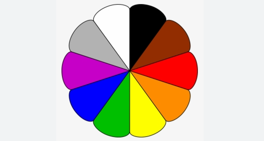
Here are the top colors for websites and why they work. This list is compiled by consideration to which colors are best for which type of website, what is trending, and what different colors communicate.
#1. Red
The color red symbolizes power. It captures and holds people’s attention, making it the most popular color in marketing.
For a website’s color scheme, red is incredibly popular. Its versatility allows it to convey a wide range of emotions. It elicits emotions like excitement, passion, speed, energy, boldness, and youthfulness. When used sparingly, it is particularly powerful.
One technique to use red effectively is to use a light touch to add a pop of color to something as modest as a few important textual phrases.
Another strategy is to combine several softer colors with red. This is a more sophisticated color palette strategy. Consider using soft color codes with red on your website if you want to get contemporary and bold with your color strategy.
Just be careful not to use too much red. Make sure you have enough of the softer tones to allow your page to breathe while maintaining a fashionable appeal.
Red is a fantastic color to use when you want your audience to take action. It is a fantastic color for branding. It stands out and is quite attention-grabbing when it comes to the creative theme.
Some of the target audiences and actions best suited for red are younger audiences, call to action, urgency, medical/healthcare industry.
The color is frequently utilized in restaurant and takeaway apps, as well as color schemes for e-commerce websites. When you’re hungry and ordering takeout, you’re passionate about getting your food quickly!
Red is always the color of the word SALE and is frequently used as a professional’s tie color.
#2. Blue
The most adaptable and universally liked color is blue. Because it has been demonstrated to evoke feelings of trust, it is a top choice for website colors.
Blue inspires feelings of dependability, trust, authority, and strength. Therefore, if you want to be perceived as trustworthy and cool, it’s perfect for you. For optimal results, combine blue with complementary colors.
Blue is frequently seen as the most secure color. This is due in part to the fact that it is the “favorite” color of the vast majority of people.
Over half of all logos feature blue. This color is used by bigger organizations like banks and manufacturers to inspire trust. Blue also appeals to metropolitan, fashionable, and contemporary men.
Shades of blue evoke sentiments of tranquility and productivity. For instance, deep blue and teal complement each other effectively on a background that is predominantly white. Additionally, males still frequently choose the color blue, making it perfect for any company selling men’s apparel.
#3. Green
Whereas blue is recognized for its calming effects on the human brain, green, on the other hand, has a certain natural and organic feel to it.
Green is an adaptable color. Customers feel at ease since it is cozy and welcoming. Second, it symbolizes benevolence, the environment, and health. Finally, because green is the color of money, it inspires thoughts of prosperity.
The softer green colors feel natural and have a calming effect on website visitors.
Calming and organic, green is ideal for a color palette when designing for a health brand. It is a fantastic color choice for expressing sustainability and eco-friendliness.
In general, earthy colors, especially darker green hues, have strong associations with all things natural. Additionally, they are a great choice for any organization or business operating in the environmental sector.
Green is also commonly used for CTAs, especially when used exclusively on a website dominated by neutral colors.
#4. Black
Another hue with a lot of versatility is black. It could be lively or soothing, traditional or modern. It adds intensity to any atmosphere you want to create when used as a contrast hue.
Black attributes modernism, luxury, refinement, sleekness, and neutrality. Black and white are popular colors for brands that wish to convey a sense of balance and calm.
In most cases, black is used pretty much sparingly. On some websites, it’s usually reserved for text, instead of being one of the primary colors or the background. However, it doesn’t mean that you can’t use dark blacks more frequently in your website’s color scheme. When you do this, especially when you use different shades of black, you can convey sentiments of class, luxury, and professionalism.
Its minimalism is perfect for luxury websites; many cosmetic brands choose black as their primary color to signify the quality of their goods, which may help you rationalize spending so much.
However, if you’re going to use black on your website, remember to employ a variety of shades to give it depth and texture. A heavy black gradient gives your site an ominous, bold look. A monochromatic look will be dull and basic.
#5. Orange
Orange represents energy. It has strong attention-grabbing qualities, is entertaining and stylish, and gives clients the impression that they are working with a forward-thinking business. In this situation, your targets will be the food, technical, construction, and safety industries.
Orange can be a metaphor for security, assurance, friendliness, optimism, or even happiness. It is widely recognized as a “fun” color, and using it in combination with certain hues in your website design could be a terrific approach to convey that you don’t take yourself too seriously. When pursuing a business that engages in enjoyable activities, such as those that encourage creativity, this is incredibly helpful.
If you want something memorable and stimulating, go for an intensely brilliant orange color.
Orange colors complement blues rather effectively. Although this color combination may appear to be an odd fit, it greatly grabs the attention of visitors when used with brilliant colors. When you use orange as the background color, the other components on the website stand out.
#6. Yellow
Yellow is a powerful color, but it also can be the most dangerous. Although most people are unaware of it, yellow is the most attention-grabbing color. You can use yellow to grab your audience’s attention and convey your confidence in your abilities.
Yellow is used to convey a variety of emotions, including caution, optimism, sunshine, warmth, and happiness. For service-related industries, this is a terrific website color to use.
Additionally, yellow conveys joy and relaxation and is frequently used as an accent color. Some of the most recognizable brands in the world, including In the example of Lego, the company successfully incorporated two vibrant colors, red and yellow, into their website design. Thanks to the white background and empty space, the color palette works really effectively.
Giving red and yellow enough room on a web page makes for a pleasant user experience because they are comparable but also complement each other well.
#7. Purple
Purple is a symbol of monarchy, riches, creativity, knowledge, and confidence. It is a distinctive, powerful color to employ in a website’s color scheme since it stands out and demands attention. Also, it is a fantastic color choice if you want to come across as having some sort of authority or experience.
Being the hue of royalty, it’s ideal for adding a dash of sophistication and authority to your marketing materials. The landing page gains a certain intriguing air of suspense when you use purple as a background gradient.
Lilac is also in fashion. Any current fashion publication you flip through will show this particular purple seeping through the pages and into your closet. In contrast to the ubiquitous millennial pink, it is light, soft, and stylish. Pink and purple coexist in nature easily similar to all flowers that have warm pink and purple tones.
#8. White
White is a color that stands for minimalism, transparency, minimalism, purity, and cleanliness. Sometimes using no color at all is the greatest option for simple web design.
Since white is a neutral color, it may be easily paired with various hues for branding purposes. It is frequently used as a background or accent color. A neutral backdrop color, like white, enhances the prominence of the accent color while maintaining the minimalist aesthetic of the website design.
A black-and-white color scheme is ideal, as we have seen above. It is advisable to have a dark background when utilizing white text in order to make the text visible and readable. The colors of particular products look more bright when there is a lot of white.
#9. Gray
Website color schemes that employ shades of gray with a dash of the main color to highlight an element are less distracting and help your audience concentrate on what’s essential to them.
It is possible to bring more vibrant contrasting colors to the center shape when you utilize lighter and duller gray tones in the background. A gentle gray background makes the photographs, text, and colors stand out more than going overboard with intensely saturated dark hues.
#10. Brown
Being an earthy tone, brown is known as a comfort color, giving relaxation to customers.
Brown is organic, earthy, wholesome, warm, and honest. It is a calming color when utilized in web design. It offers websites a genuine, earthy vibe and frequently complements a classic, vintage-inspired designs.
Conclusion
It’s crucial to choose colors that work with your target audience and your intended behaviors. While one hue can increase traffic, it could also turn users away.
You may develop a contemporary, fashionable, and distinctive website by starting with these colors and using them to create color palettes.
You’ll probably discover that picking the ideal website color isn’t difficult at all. And when you do it, you give your brand the push it needs to entice both new and returning customers.
Before you start exercising your creative faculties, there are a few things you should be aware of. The color scheme of your website should match the brand’s style requirements. Consider the core principles of your company, adhere to fundamental color theory, and use your intuition.
Don’t worry if you don’t have a comprehensive style guide handy. Asking yourself if you are in line with your goals should help you develop the finest website color design for your company. What do you want your company or online venture to accomplish? What does your business value? How do your logos, advertising products, and other marketing materials now look?
When it comes to color schemes for websites, you want to leave the proper impressions and connections with viewers.